HealthNote
Automated follow-ups and patient triaging
Responsibilities: User Research, Competitive Analysis, Storyboarding & User Personas, Wireframing, User Flows, Prototyping, User Testing, Visual Design
The Process
Our team had 1 month to create a concept design in time to present at the 2016 Healthcare Information and Management Systems Society (HIMSS) conference in Las Vegas. Stakeholders had a vision for the product; they wanted my team to design a platform for clinic and hospital staff to create automated follow-up programs to be pushed out to their patient's mobile devices.
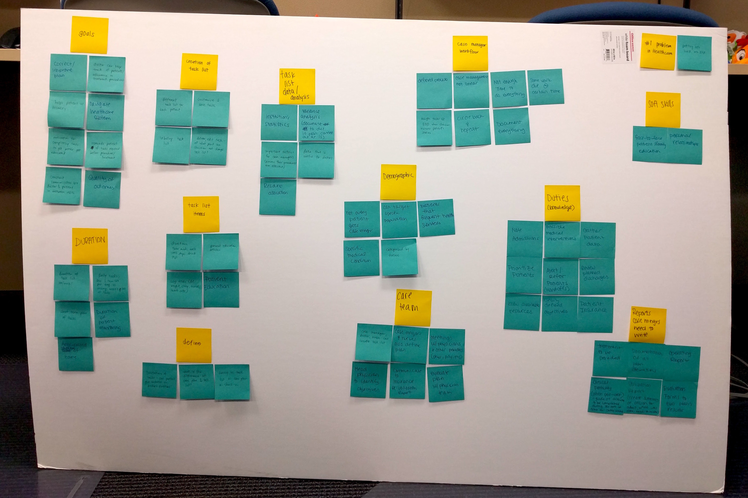
We began researching current workflows for follow-up and aftercare processes within healthcare facilities, what types of patients require aftercare programs, and the overlap of these patients and mobile device use. Essentially, our stakeholders wanted the platform to be a survey builder where hospital or clinic staff could create complex survey trees where a patient's response could lead them down several different paths of questions. Through our research, we found that pre-created templates would be more useful than a tool that would allow clinicians to create survey trees. Most doctors and nurses are too busy to create their own custom survey trees for each individual patient. Despite this, our stakeholders wanted to move forward with giving users the option to build a survey tree from scratch. My design team decided that a way to add more value to the product would be to triage patients on a dashboard based on their given responses to the surveys.
We created a high level flow of the entire product and outlined all the possible actions the product could do. After multiple discussions with stakeholders, we mapped out all possible flows.
The User
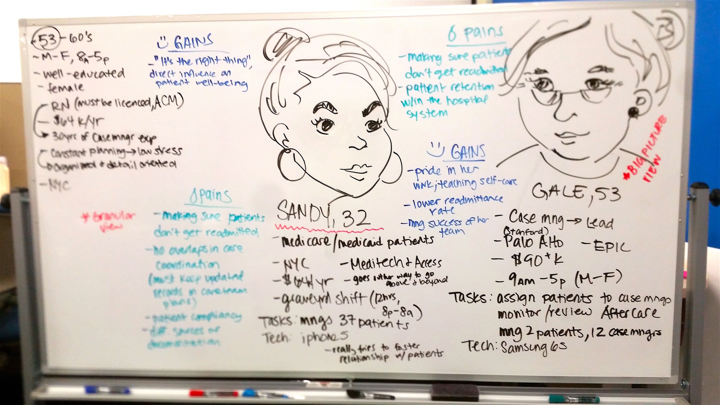
We developed 2 personas of case managers who would use our platform and used them as guidelines on which to base our design. We decided to focus on Sandy, the case manager, as she would be the person who would be on the ground floor, interacting with patients directly.
The Use Case
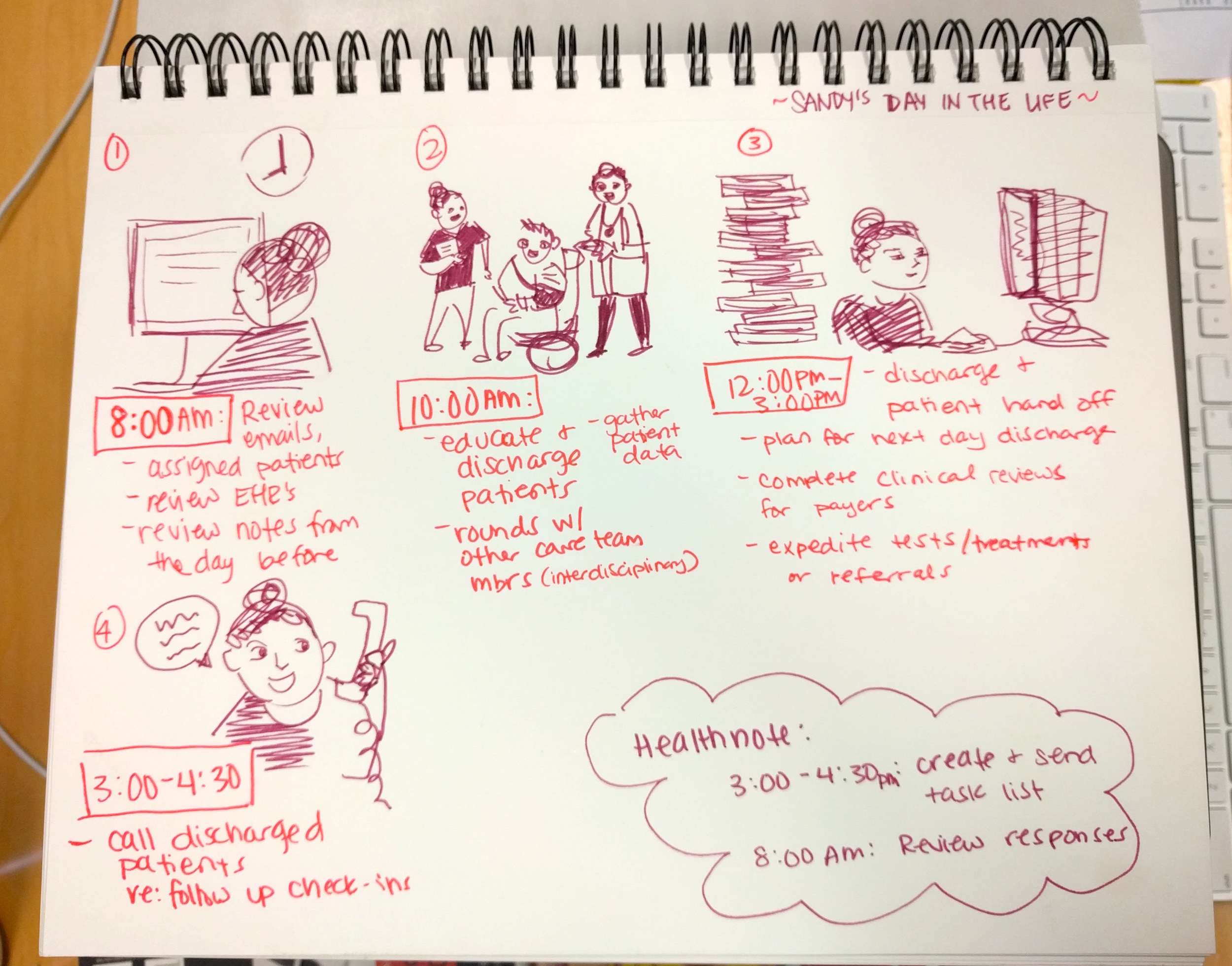
We storyboarded a typical day-in-the-life for Sandy to see where HealthNote would best fit in with her current workflow. Because she has so little time in the day, we needed to create a product where she could accomplish her task in 15 minutes or less while feeling confident she completed what she needed to do.
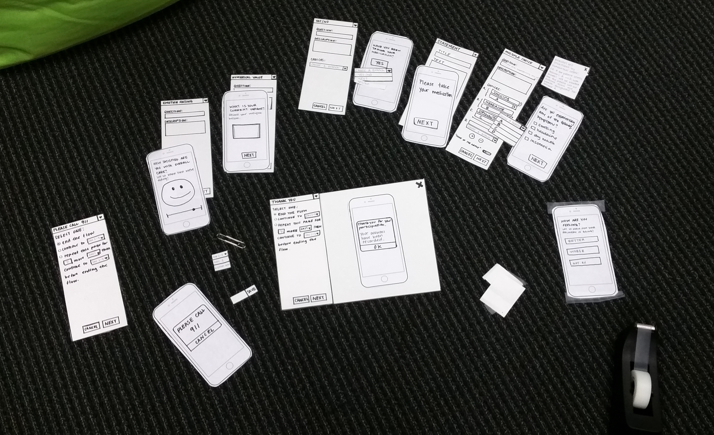
To help our persona quickly create follow-up flows, we structured the product in a way where the user would be presented with fewer options, thus limiting the number of error flows they could encounter. We created paper prototypes and tested our designs. Due to limited resources, we conducted several rounds of testing on medical professionals we knew personally and iterated based on their feedback.
The Result
The final design includes a dashboard on which patients who have triggered alerts appear. Users can quickly scan responses to survey trees and follow-up with patients who need the most attention. The survey tree builder guides the user in a structured step-by-step format, limiting user errors and reduces the amount of time correcting mistakes.


